PJ 2015: the wrap up
Being immersed in design practice often means that you forget to document processes, so I wanted to jump in here and write a bit of a post-design review of the processes we went through to get the Picture Justice 2015 exhibition up to where it is now.
We received the proof from the printer this morning, and I'm about to go through it and complete final checks, but so far it all looks good.
In terms of the final design decisions, we went through several stages. This is the final logo:

By deciding on the logo first, this gave me a more refined scope within which to start designing. We played with the idea of making the entire exhibition black and white, and just adding splashes of colour to images, such as this one below:
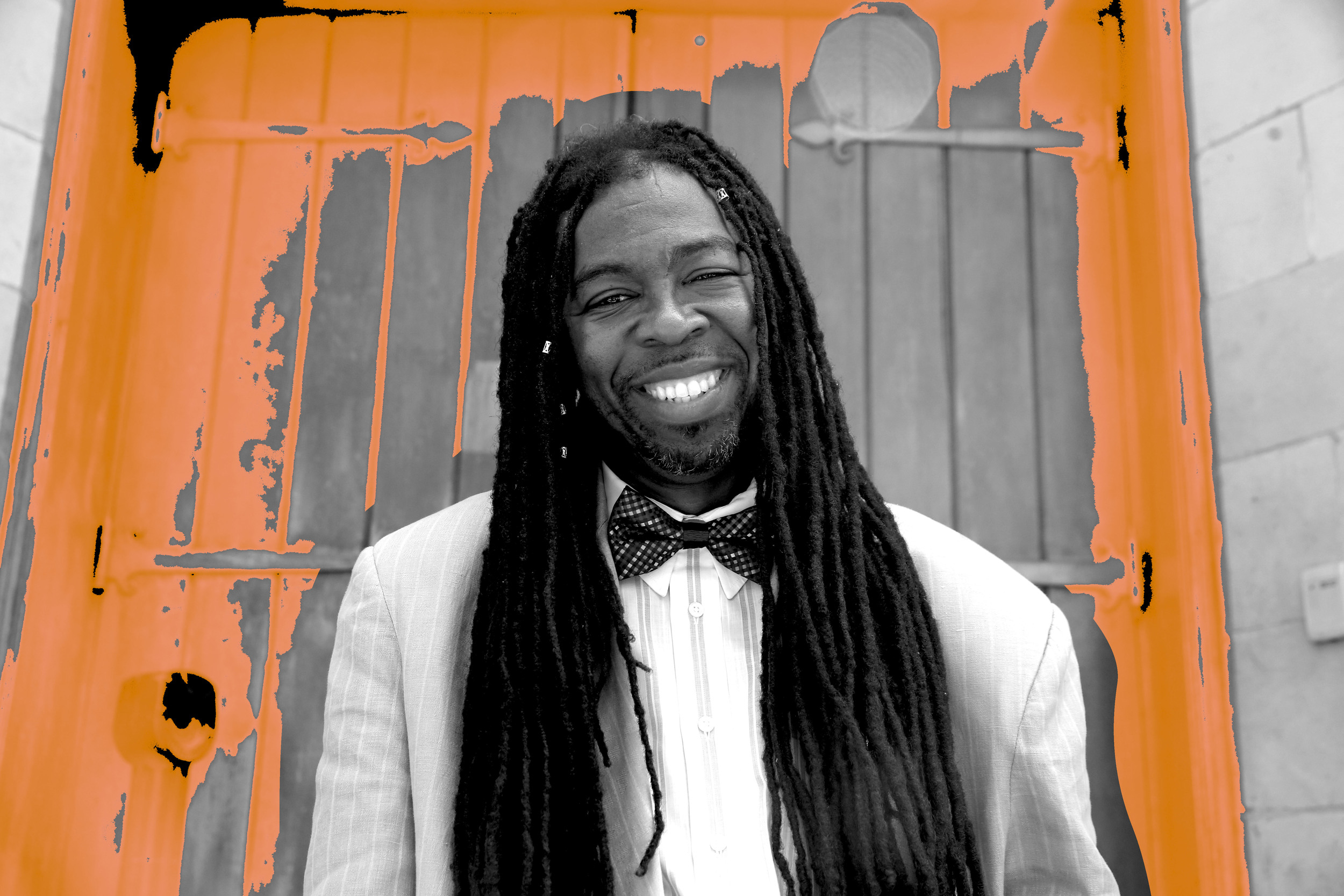
This option was not followed through with as there were concerns that the teaching and learning aims of the Picture Justice workshop program were not focused on black and white photography.
Moving on from this, the main concern was how to get the quiet black type to balance with the coloured images (the typographic term of 'black' being used here - that is, how much black is on the page when the type is set, compared to the white space.
I began by laying out the panels with the images and type on their own, but it didn't sit right with me.

There was a bit too much white space and the design felt unresolved. I then created a background pattern, using a single fingerprint.

It was also suggested that the quotes from each person in the images be in their own typeface. I would have liked to have had a bit more time for the interpretive process of this, but it was an interesting exercise in attempting to match up typefaces to people without using the binary system from my research. Here's one example - Easy is a 61 year old man who has been in and out of prison for many years, as his father before him was, and now also his son. There are certain typefaces I avoided, including graffiti styles and those with a more feminine feel to them. This was one possibility:

In the end, one of the typefaces I used for another panel's quote was used for all quotes. Again, it would have been great to have more time to explore this option further, but the deadline was looming. The following image shows one of the final panels:

The final typefaces used are Futura (bold and regular, headings in all caps) and quotes in vicHand - this second typeface was one of the experimental options chosen for individual typefaces, and was chosen by the curatorial team to be used for all quotes. In my opinion, it is also a good typeface to use across all panels, because it is not overtly male or female. It is also organic enough to be visually interesting.
Summary
What I would have preferred is more time for this project, but one of the benefits to come out of this whole process is, firstly, the curator has seen the benefit of having a detailed design brief. As we move into our next project, "Unearthed", we will begin here. Also, Deb, our project coordinator, has also seen the value of a really organised approach to projects, and I feel that this particular exhibition has been extremely beneficial for highlighting the areas that we need a lot tighter organisation. This is particularly true for supporting the interpretive process in design, to ensure that the vision of all people involved in a project can be realised accurately and dynamically. I really do feel that by researching these processes, we are all starting to come together on this idea, and I am really looking forward to implementing a more detailed process for Unearthed.