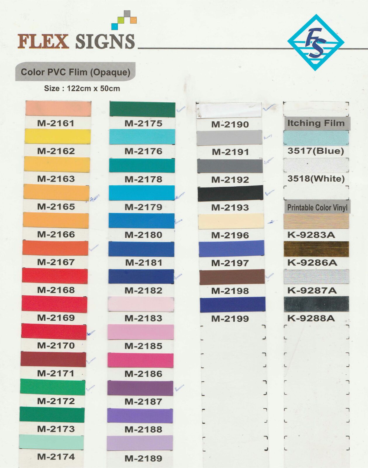
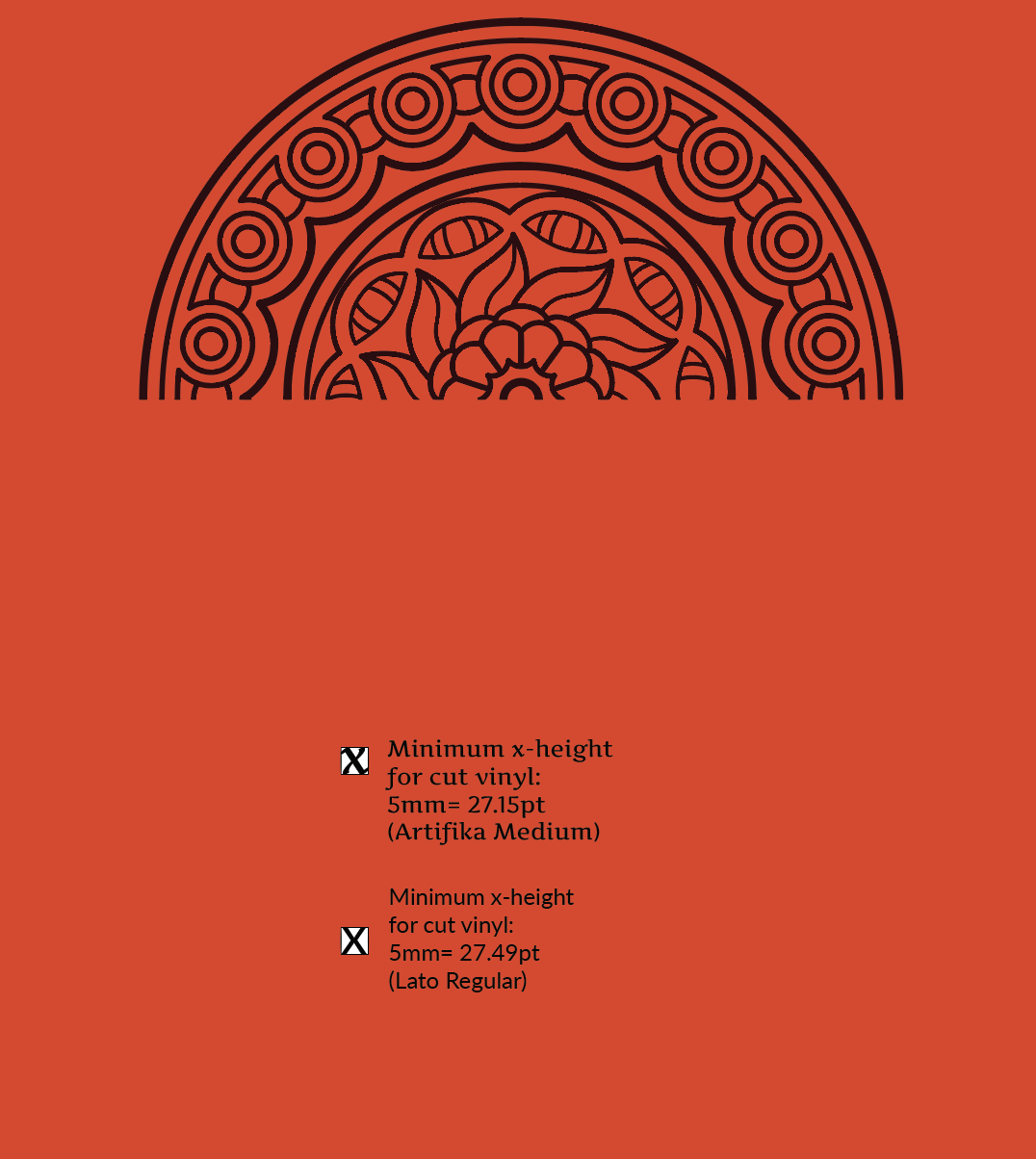
Vinyl and wall colours
The colour swatch has been sent from the production people in India. To paint the walls gold requires a specialist auto paint (curious), so instead we've decided to do different colours for each section of the exhibition. I'm now looking at colours for the survivors and upstanders sections.

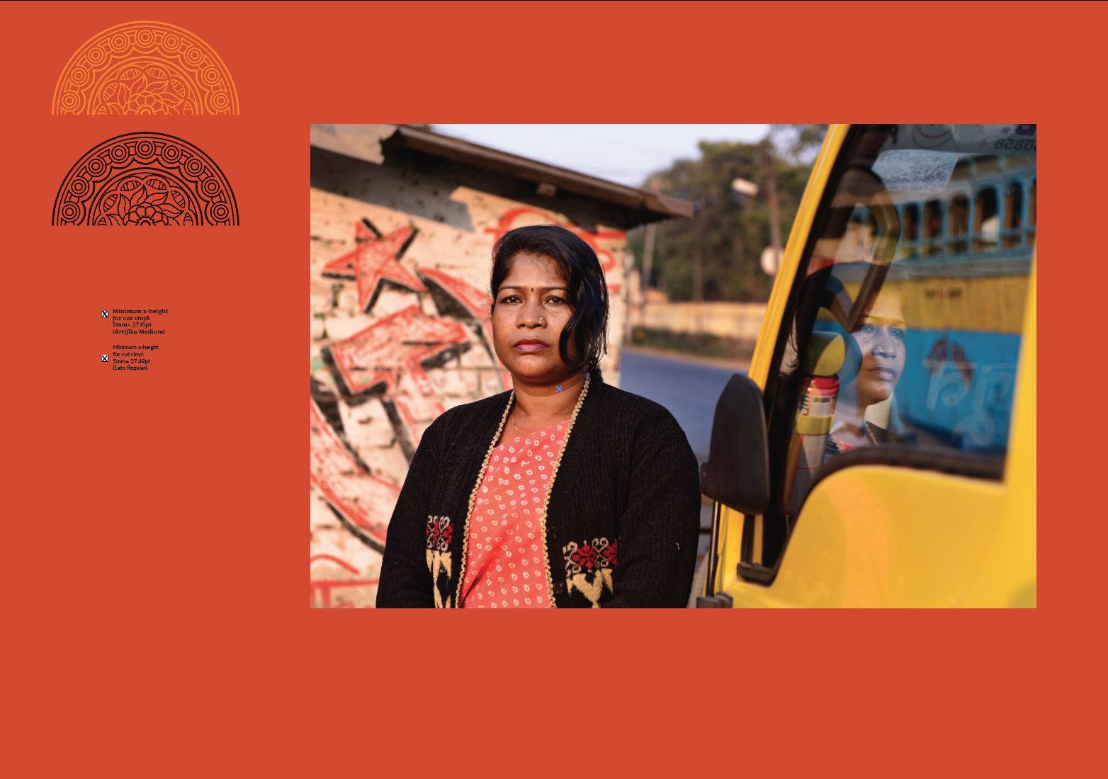
Because there's a gold vinyl available, we'll go with that for the survivors section, but need a dark background so it creates enough contrast to be legible. We've pretty much decided to go with the logo that has the writing on top (because it gives a bit of a lighter, more open feel, and also because it makes the type treatment more obvious and can be used as a visual linking device between English and Hindi throughout the exhibition's section logos).

Source: https://cdn.vectorstock.com/i/composite/62,43/indian-hand-drawn-hamsa-with-ornaments-vector-4076243.jpg
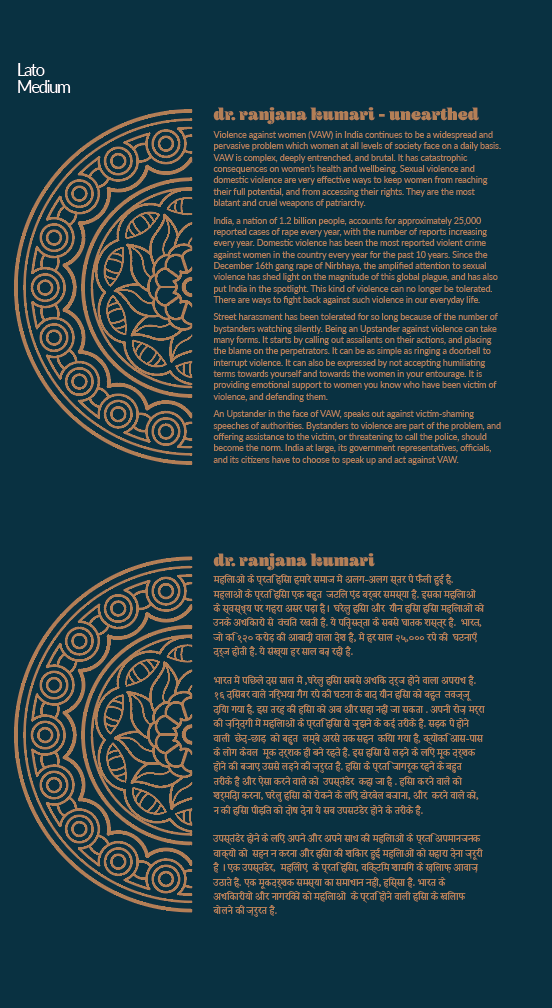
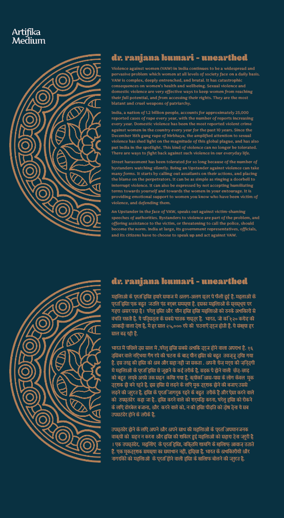
The next thing I have to do is work out how the graphics and text will go together on the panel, and if I can fit both into the vinyl measurements I've already sent, or whether we'll need more. A really nice accidental side note, that was quite accidental, is that when two columns of text and half mandalas sit together on the page, they look a bit like the Indian hand image:
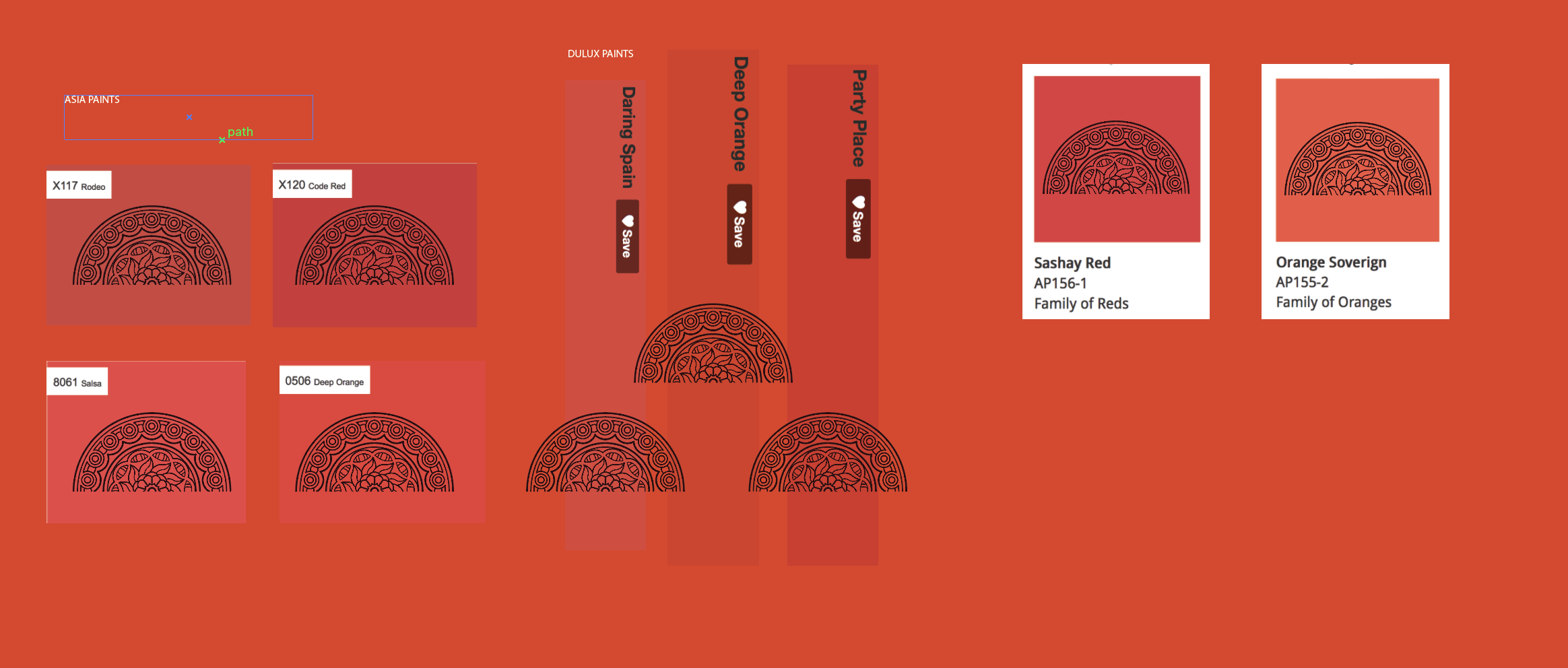
I've also started looking at colours for the second section on upstanders. It needs to be a colour that goes well with the first section, because they will be viewed together (first section of stairs). I sampled one of the red/orange colours from the background of the hero image of that section and it looks really amazing up against the deep blue. I would love to go with a deep yellow for the vinyl of this, but for the sake of contrast and legibility, I might go with the deep chocolate brown, sampled from the vinyl colours.
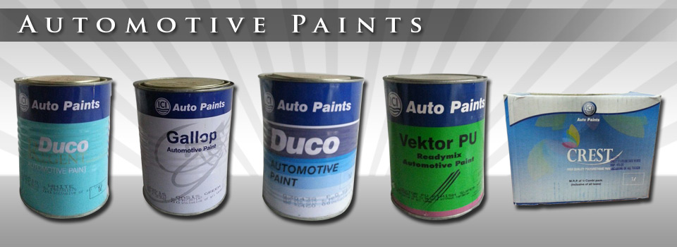
The next step was to do some investigation into paints available in India and then try and match the colours as closely as possible. I tried the swatches of four different companies for the Survivors blue and couldn't find a close match. I came up with a better match for the orangey-red. From these, I chose the colour for the 'places' section, which I want to be quite dark and a little unsettling. However, I have brought back the metallics for this, and gone with a light metallic vinyl for the graphics and text.
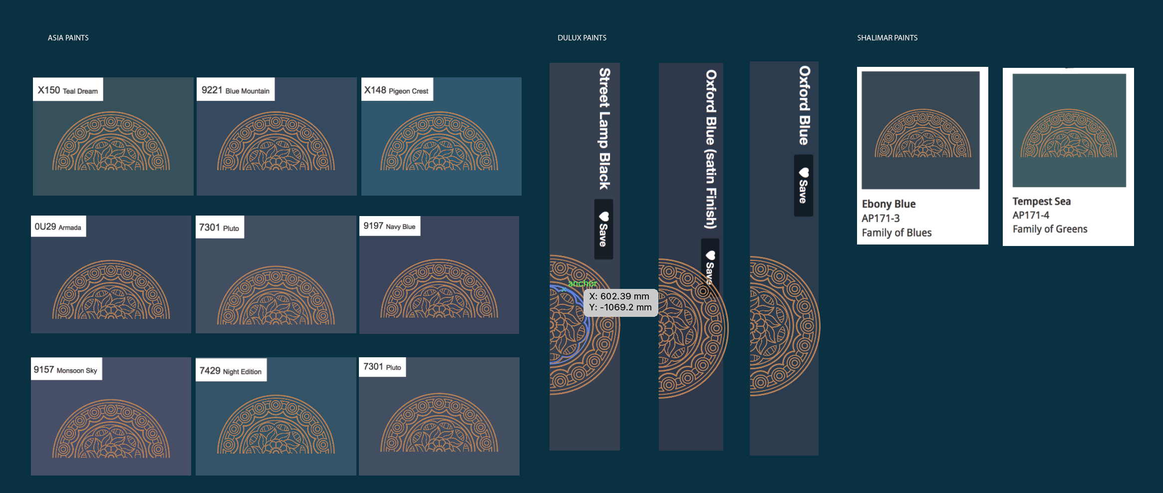
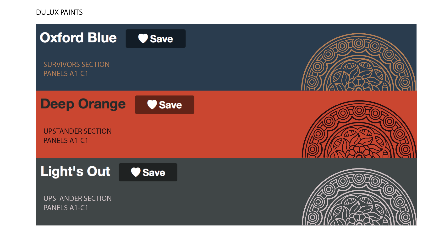
Now that I have the colour schemes, I will go ahead and design everything in black, as it won't be printed, but laser cut. The final colour schemes are:
Section 1: Survivors
- Wall paint: Dulux "Oxford Blue": https://www.dulux.in/en/products#colorSpaceId=413907&colorId=1114526
- Vinyl: LG Hausys LC 2000 Series LC4739G Metallic gold
Section 2: Upstanders
- Wall paint: Dulux "Deep Orange": https://www.dulux.in/en/products#colorSpaceId=413907&colorId=1114526
- Vinyl: LG Hausys LC 2000 Series LC2072M Deep Brown
Section 3: Places of Rape
- Wall Paint: Dulux "Lights Out" (https://www.dulux.in/en/products#colorSpaceId=49866&colorId=1114449)
- Vinyl: LG Hausys LC 2000 Series LC5510 Metallic silver