Design ideas for PJ 2015
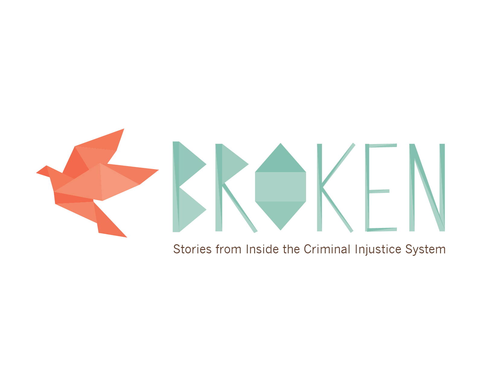
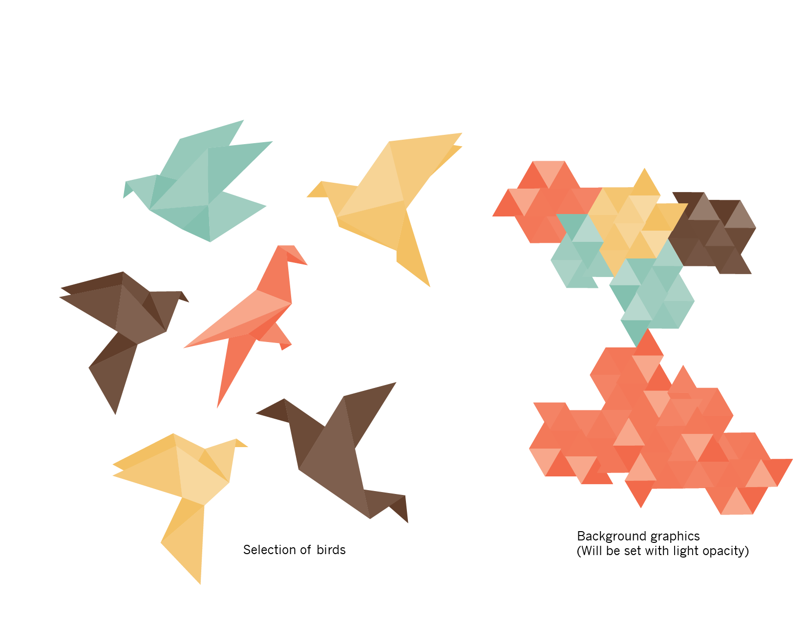
Further to my post from this morning, I've started thinking about possible directions, and I was thinking mostly about birds (they seem to be on my mind a lot!). I started looking for simple graphics I could use (vectors of various birds) and came across two options that really struck me. The first is by Freepix (thanks for that!). They have some origami bird vectors that I felt I could base other parts of the design on as well, including the typography. The images below show the logo type and one bird, as well as the other bird variations and a background graphic that I created which could be used at a very low opacity.
Pros: It's a really unexpected approach to an exhibition about incarceration, and is aimed at upturning the stereotype of 'jail bird'.
Cons: Could be perceived as too feminine (perhaps a colour change could resolve this). Perhaps some people won't make the connection, so this will get a bit lost. I would also like to use the origami style for the background, but explore a bit more variety in it, as a lot of these triangle backgrounds are around lately.
The other option I'm thinking of is to use a pen and ink style, after a search for possible artworks, I found a great bird that to me really represents being 'shot down in flight' - a metaphor for a life interrupted by incarceration.
Pros: I really like the very strong visual representation of this version.
Cons: I can't actually think of any right now! I am torn between both, but for the purposes of this project, think that this is the better fit. I will have to try it within a panel mock up and see what the headings look like with images.
